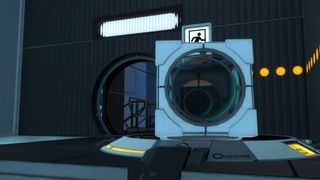
Test results seemed to suffer when subjects were looking at or within the confines of a maintenance area. Currently, there is no reason as to why this happens, with the best theory being the magnitude and endlessness of the environment get in the test subject's head.
I am addicted (pun intended) to Portal 2's mechanical areas. I love the twisting pipes, the catwalks, the void boxes; everything about them appeals to me aesthetically. While that love of them is great, it's also extremely dangerous when I have access to mapping tools.
The heel to showing off mechanical areas - especially those close to the player's proximity - is how much effort they require to pull off. Depending on how open of a space you're giving the player to move around, your potential workload skyrockets if you want to create a believable location that feels as if it's more than just boxes floating around. That requires a minimum level of detailing that serves multiple purposes, including:
- Making the location appear bigger than it's actual size
- Preventing players falling to their deaths from seeing any
nodrawtextures - Making the space feel lived in despite its emptiness.
Not all mechanical areas have to be open. Valve has several areas in the main campaign where they either keep things close quarters, contain the level to within a box, or even combine the two. This meant Valve had less detailing they needed to do game wide, and indirectly let moments like reaching the Central Core have a greater emotional impact.
When you're making something for the workshop, however, the biggest thing on your mind is "how cool does this look?" I don't want to phrase that as a problem as that thought drives what you end up creating, but at least for me it's always short sighted in how to incorporate mechanical areas (assuming they're needed at all). Ultimately, I put it most bluntly in the map's description...
This map would have come out sooner if I [...] decided not to add a pointless BTS area to the map. But I CAN'T HELP MYSELF THE STYLE IS SO GOOD.
